Responsive Web Design

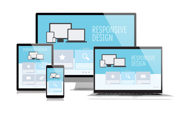
Responsive web design is not just a matter of squeezing and stretching. It’s about delivering one website in countless ways depending on the width of the screen. What to add? What to remove? How to prioritize what’s most important? What are the implications for search rankings? And how do you do all of that with just one code base? It truly takes an expert to create a responsive web design.
-
Bronze Package
-
From R199pm
-
1-3Page Responsive Website
-
Online Enquiry Form
-
Google Location Map
-
Website Security Package 100
-
Sitemap Creation
-
Submission to Google for Indexing
-
R999Initial Setup Fee
-
Silver Package
-
From R249pm
-
4-6Page Responsive Website
-
Online Enquiry Form
-
Google Location Map
-
Website Security Package 100
-
Sitemap Creation
-
Submission to Google for Indexing
-
R999Initial Setup Fee
-
Gold Package
-
From R299pm
-
7-10Page Responsive Website
-
Online Enquiry Form
-
Google Location Map
-
Website Security Package 100
-
Sitemap Creation
-
Submission to Google for Indexing
-
R999Initial Setup Fee
What makes a website responsive?
1. Hidden navigation menus.
On smaller screens hiding the main navigation menu is a good way of keeping layouts simple. An icon, text or combination of both indicates to the user where the menu is. Your options include a simple drop down menu where the menu slides down and covers the main content below or the overlay method where the menu expands and covers the whole screen.
2. Balance font weights and sizes.
The size ratio between headers and paragraph text should be well balanced. Large headers don’t look good on mobile, especially if they stretch over a few lines. Everything should be resized appropriately. Newer mobile devices have high-resolution screens, which makes text more legible and easier to read. You can afford to go a little bit smaller on mobile screens and increase the font sizes when you get to a larger display.
3. Optimal reading widths.
While making a layout wider on larger screens, it is important to consider the line lengths of your content.
If a line of text is too long it’s harder to read because it’s difficult to follow line-to-line. Similarly, having lines that are too short breaks the rhythm of reading as the eyes have to move back-and-forth too often.
Common practice is to keep line lengths at about 60-75 characters. This can be achieved by setting your text areas to have a max-width of approximately 500/700 pixels wide.
4. Put important information near the top on mobile.
Show telephone numbers, contact info, buy now call to actions, etc. at the top on mobile. Mobile users want information quickly, but this also works well on any device. Even with browser sizes being so varied now and the idea of the “fold” not really existing anymore, putting key call to actions at the top of the page is still important.

5. Hiding content on smaller screens.
On mobile you can simplify the layout by hiding content that would be visible on larger screens, either by hiding it completely or using tabs and accordions to show/hide content. This declutters the page on smaller screens and lets the user see all the key info, with options to view more if they wish.
6. Showing more content on wider screens.
Having a wider screen allows you to push more content further up the screen. More content is visible to the user straight away, before they have to scroll. Layouts can expand and accommodate more columns.
7. Replace enlarge image functionality with long scrollable gallery pages.
On small devices, having an enlarge image window doesn’t work if the image you are already looking at fills the screen. For image galleries, use a long scrollable page, or a swipeable carousel with left/right arrows. The long scrollable gallery also works well on tablet and desktop.
8. Optimise the design for touch screens.
Add swipe gestures to banners, menus, image galleries etc. Touch screens are by nature intuitive to use, therefore we can be more subtle with navigational aides, e.g half an image off the screen on a carousel suggests that there is more content to come. Hover events are inconsistent on touch screens. Disable these and replace with touch events. If the content to be displayed on hover isn’t critical and just fancy embellishment, then disable it on touch screens all together.
9. Use less images.
A lot of effects, like background gradients and button hover states, can be achieved by pure html & css. Pages load faster, which is especially good for mobile, and less time is wasted creating lots of graphics. Using fonts for your icons means you don’t have to create images. They are scalable, have cleaner edges, load faster, and are good for retina displays. This optimisation works great on all devices and screens.
10. The fold no longer exists.
Devices are smaller, taller, wider, and longer. It’s not important to cram everything at the top of the page. Let pages breath and expand with long, flowing content blocks and generous spacing. People naturally scroll. By giving them more content below the “fold” you’re actually inviting them to be more engaged with the page and to read your content.
Conclusion
Check your Analytics, mobile traffic is a higher percentage than you think. And it’s growing month-to-month. If your site isn’t responsive, every single mobile user that comes to your site is having a bad experience. Even if it is responsive, there are a number of areas where it can be improved.
Responsive web design is our speciality. Hire us, we’ll do the job right, and you’ll never have to worry about a bad mobile experience ever again.
